Before we dive into randomized color palette generation, a little context on what brought me here:
Little And Often
I’ve been spending some time reviving a project that I’d started and abandoned mid-last year. The idea of using small, frequent periods of work to make progress towards big goals is one that’s stuck with me over the years: basically favoring putting in 20 minutes a day on a task versus dedicating an entire Saturday afternoon. It’s effective for chopping up very large projects into manageable pieces, but also has some notably favorable effects on learning/skill acquisition and exercise-induced physical adaptations.
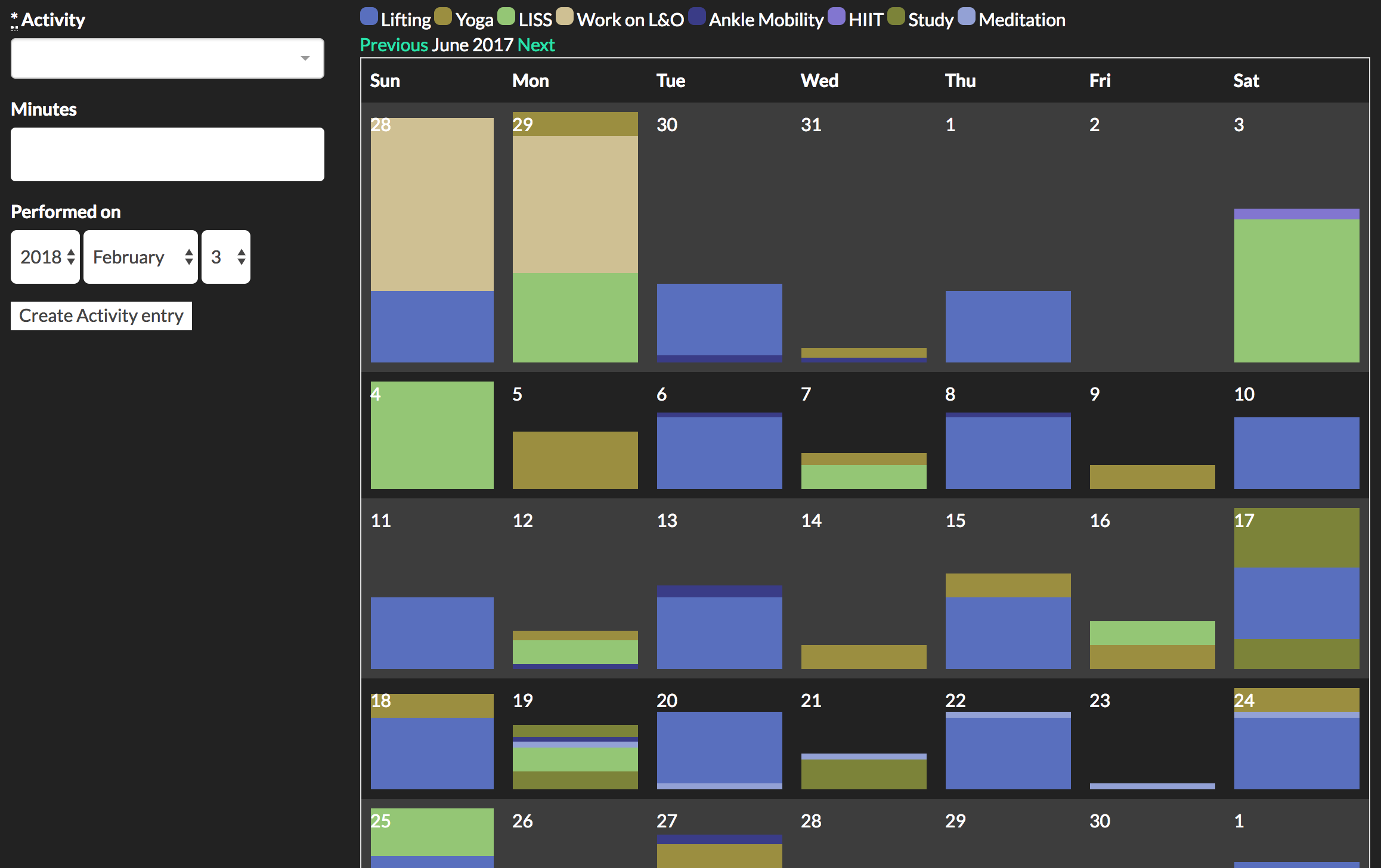
It’s also a pattern that has been a real challenge for me to undertake on a regular basis, and I was trying to figure out what I could do to boost my adherence to these kind of relatively short, daily sessions. I decided to try building a visualization of them, plotting the time spent across a calendar view—much like Jerry Seinfeld’s Don’t Break the Chain. I wanted something that I could glance at to see where my time was going over a week, a month, a (gulp) year.
It’s currently in only-usable-by-me alpha mode, but the project is called Little And Often, from strength coach Dan John’s advice to “train little and often over the long haul”. It looks something like this:
Getting this calendar of activities to be aesthetically pleasing proved more interesting than I thought. I initially picked a color palette by hand (using this nifty tool at Coolors.co) to give each of the activities some contrast with each other. But since the palettes were limited to five colors. as I added new activities to track, I had to start repeating colors and the whole thing became harder to read at a glance. I wanted to be able to add more or less arbitrary numbers of activities, and so it became clear I’d need some way to generate randomized color palettes; hopefully ones that wouldn’t look like an acid trip through the Crayola factory.
Research
The task at hand, then, was to build a system for picking an arbitrary number of colors to form a harmonious palette, so that when a user adds another new activity to their existing set, it’ll show up on their calendar plot and look nice.
All the inspiration for the system and visualizations I wound up building came from these two articles:
-
How to Choose Colours Procedurally: A bit focused towards game development, but this was useful for thinking about breaking down color selection into picking a varying set of numeric values, be it RGB values or varying hue, saturation, and luminescence.
-
Automated Color Harmony Tools: This got me thinking about different ways of limiting the selection space of the colors I’d be generating, so as to wind up with a set of colors whose relations to each other were pleasing to the human eye.
What I wound up with was an algorithm that does a decent job, at least for 10-20-ish colors. I wrote this in Ruby, and the code is in the Palette class here. It works as follows:
- Gather our inputs:
- A set of arcs around a color wheel to select hues from: this is defined by up to three starting angles, and up to three corresponding ranges (in degrees) starting from them.
- An angle offset at which to start the initial arc. This was useful to have as a separate value from the angles themselves, as it made it easier to define a harmonious set of arcs, then use the offset to “spin” the color wheel around for random samples of colors from different areas.
- Initial values for the saturation and lightness values of the colors produced.
- “Jitter” values for saturation and lightness: the maximum size of random values added or subtracted from the colors’ saturation and lightness.
- A minimum geometric distance value that the algorithm would attempt to keep between each color produced in the palette.
- A count of how many colors to generate, and (optionally) a set of pre-existing colors to comprise the start of the palette.
- If no pre-existing colors were given, pick a starting color from within the angle ranges.
- Until we’ve generated as many colors as requested, do the following:
- Pick a hue from within the specific angle ranges.
- Pick a saturation using the initial saturation plus or minus a random value between 0 and the saturation jitter.
- Pick a lightness using the initial lightness plus or minus a random value between 0 and the lightness jitter.
- If the resulting HSL color is at least the maximum color distance away from each of the other colors in the palette, add it to the palette.
- Otherwise, try again (up to 100 times) to generate a sufficiently distant color. If the 101st attempt is still too close to the other already selected colors, add it anyway. This is to prevent a palette with small angle ranges and lots of colors from being unable to generate any new colors at all.
Visualization
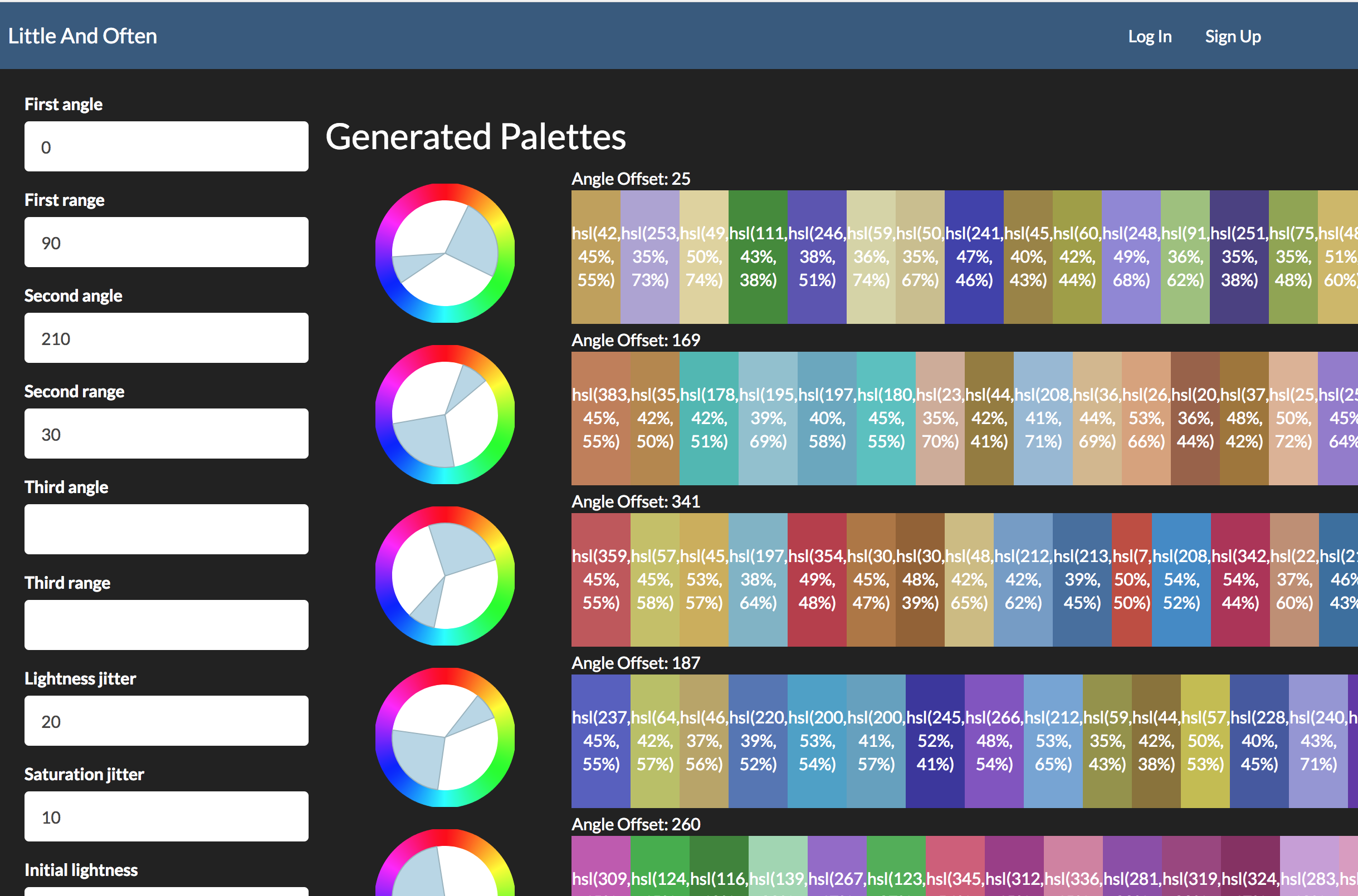
This has a ton of parameters, and trying to figure out the best or even reasonable values was tough to arrive at by just playing around in code and applying the result to my activity calendar. It was also hard to tell the difference between a bug in the code and just parameters that weren’t working very well. So, I decided to build a testing sandbox, where I could put a bunch of parameters into a web form and have it spit out a series of resulting palettes based on them.
The only parameter that isn’t on the form was angle offset—I found it more helpful to use the other parameters to draw the shape of the arcs I wanted, then have a randomized 0 to 360 offset on each sample to see what different arcs of the color wheel would look like when selected.
It’s also worth noting that I wound up developing the code and visualization concurrently. Being able to see the results of a particular approach not only helped tune the parameters and flush out bugs, but it help me figure out where the approach was falling down aesthetically and led to adding ideas like a minimum color distance and constrained randomization of saturation and lightness.
Another fun bonus to this approach: I could send the link to the page to other people with better artistic eyes than myself and get them to tool around with it and come up with good parameters. You can try it for yourself here!

